.svg)

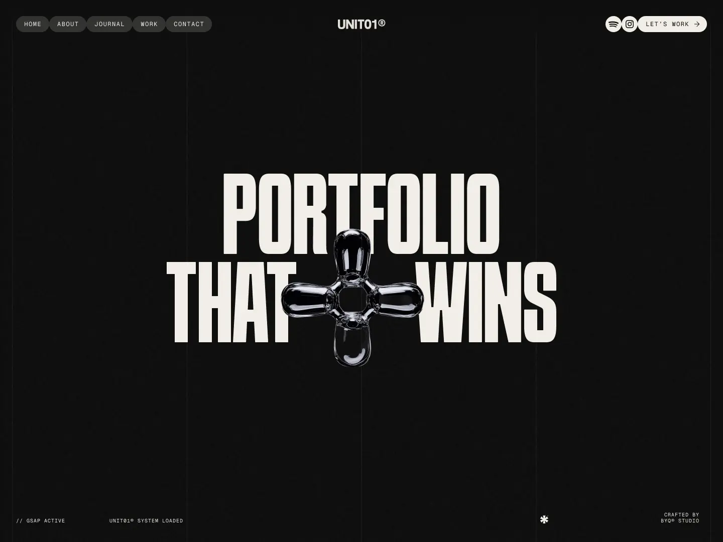
Ever opened a website and felt like your eyeballs just landed on Jupiter? That’s design gravity — the subtle (or not so subtle) force that makes a layout feel either solid and grounded… or like it’s floating aimlessly through the void.
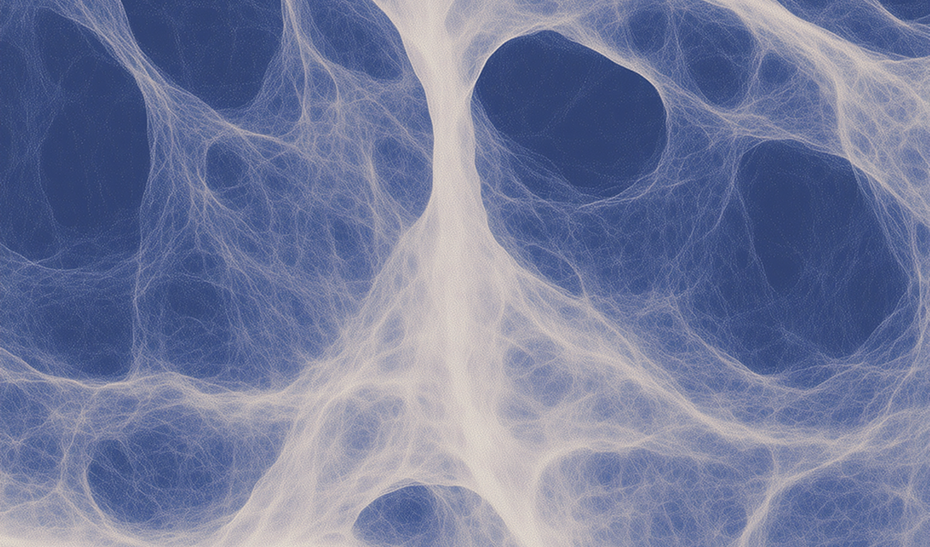
Gravity exists in design
Not just in the way objects fall, but in the way your eyes land. Just like planets orbit stars, every element on a page responds to a kind of visual pull. When that pull is intentional, your layout feels composed, elegant, and effortless. But when it’s off — when weight is unevenly distributed, or elements float with no connection — your interface begins to feel off-balance, like it’s adrift in zero-g.
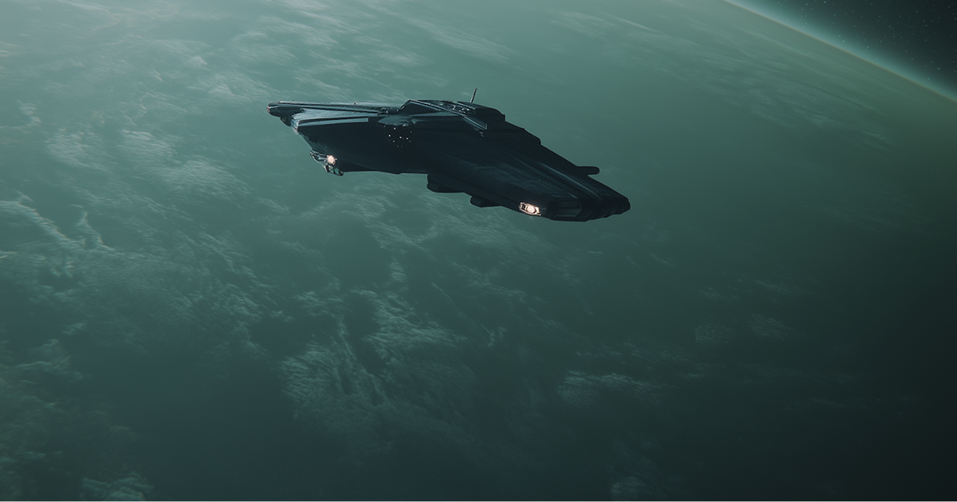
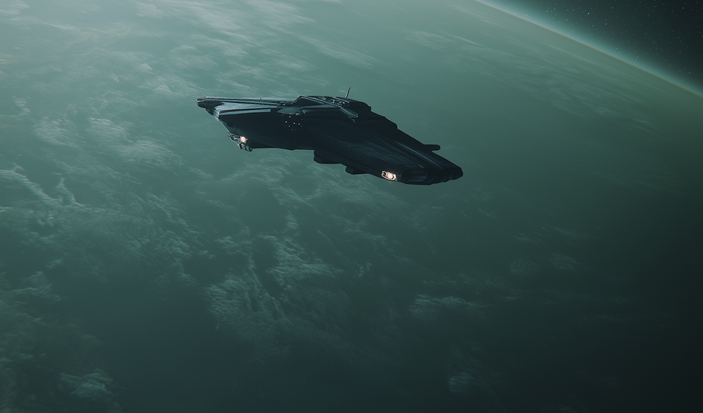
Layout like spaceship engineering
The sensation of heaviness (or lightness) in a layout has little to do with how “busy” it is. It’s about how mass is implied: bold typography pulls more than thin text. Dark colors feel denser than bright ones. A large image in one corner needs counterbalance — or it will visually “tip” the entire page. Even whitespace, when used skillfully, adds negative mass. Alignment, spacing, rhythm — they all create gravitational fields that attract (or repel) the viewer’s focus. One wrong move and your grid collapses like a dying star.
At UNIT01®, we treat layout like spaceship engineering: every component must hold its own weight in orbit. Whether it’s a hero section or microcopy in the footer, it all contributes to navigational flow. Good design isn’t just hierarchy and aesthetics — it’s physics. Because when gravity feels right, users don’t even notice it. But when it’s missing? They drift. And that’s the fastest way to lose them in space.
Grids aren’t cages
There’s a moment in every designer’s career where the grid system stops being a set of lines — and starts being the language of layout. That day, the grid makes sense. Suddenly, columns aren’t restrictions — they’re gravity wells, helping everything stay aligned and anchored. And rows? They’re time signatures. They make rhythm. Spacing. Harmony.
But that clarity doesn’t come from memorizing 12-column frameworks or copying UI kits. It comes from breaking the grid — on purpose — and feeling what happens. Overlapping. Stretching. Snapping back. That tension teaches your instincts. Grids aren’t cages; they’re exoskeletons for ideas. And when you start hearing them hum in the background? You’ve entered the next dimension.
.png)
Lost in the Margins
Margins are more than empty space — they’re oxygen for your interface. Too little, and everything suffocates. Too much, and elements feel isolated, as if they’ve been exiled from the rest of the content. Great layouts master this balance. They know when to give space and when to collapse it.
Breathing room isn’t just aesthetic — it’s functional. It directs the eye, reduces friction, and creates focus zones in the noise. It invites interaction. At UNIT01®, we call it design silence. Because just like in music, silence is part of the rhythm. Without it, everything’s just noise.
When designing in Webflow, we use margins like thruster adjustments. A pixel nudge here, a percentage push there — and suddenly, the whole ship aligns. Give your elements room to exhale. Trust us, they’ll reward you with clarity.
“Working with UNIT01® felt like collaborating with a design crew from a more advanced timeline. They didn’t just build us a site — they aligned our entire brand universe. Pixels, typography, motion… it all clicked. Every interaction was deliberate. Every detail – obsessive.”
Modular, intentional, and visually precise
At BYQ®, we don’t just design Webflow templates — we build systems with soul. Every component in UNIT01∘ was crafted like a piece of narrative infrastructure: modular, intentional, and visually precise. This template isn’t a shortcut — it’s a foundation for brands that care about clarity, rhythm, and design that feels like it belongs in the future.
Explore more templates with backbone at byq.studio.
